If you’ve ever sent an email campaign that looked perfect in one inbox and completely broken in another, you’ve seen the challenge of email rendering firsthand. Despite being built with HTML and CSS, emails don’t behave like web pages - they’re interpreted differently by every client, browser, and device.
With email maintaining its position as a top way to reach audiences in 2025 (Hubspot, 2025), and studies suggesting 75% of people admit to using their phones to check email more than any other device (Porch Media), it’s never been more crucial to know your campaigns don’t just render correctly on your device, but across all of the devices your customers use including newest models such as the iPhone 17.
Why emails render differently across devices
Each email app uses its own rendering engine to display content, and these engines don’t all follow the same rules. Between Apple Mail using WebKit (the same engine behind Safari), Gmail sanitizing code and removing some CSS for security, and Outlook on Windows rendering differently again; your carefully curated emails could look entirely different to every user. Add to that the fact that each device type also renders things differently, and you’ve got a situation whereby you can work on an email until it’s perfect – yet users with different devices could find the text wraps differently, images blur, and layouts shift just enough to break your design.
What’s new with iPhone 17?
Tech moves fast, so you need a testing tool that keeps pace. This is why Mailosaur is now supporting email previews on the iPhone 17, the introduction of which brings plenty of updates that subtly change how emails display:
- A higher-resolution retina screen means images render more sharply - but also reveal pixelation if they’re not optimized.
- Adjusted screen dimensions affect responsive breakpoints.
- WebKit (the engine behind Mail) has updated CSS support and dark-mode behaviour.
- New Mail Privacy Protection features can alter how remote images and tracking pixels load.
- Even small differences in display density or CSS handling can affect how your headers align, how CTAs wrap, and how background images appear.
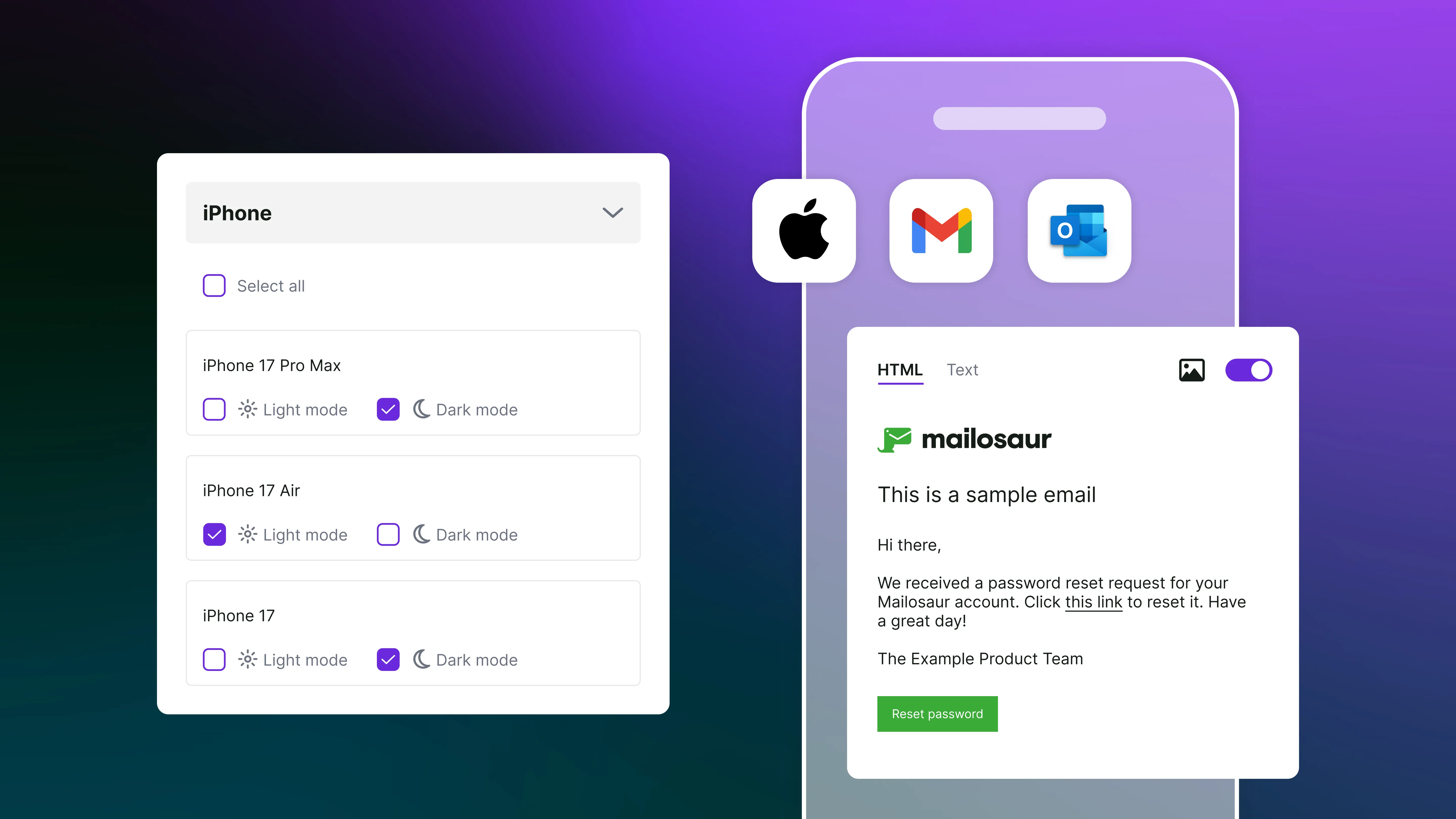
Mailosaur now supports iPhone 17 email previews
With full iPhone 17 preview support, across the iPhone 17, 17 Air and 17 Pro Max, Mailosaur helps you see exactly how your email will render on Apple’s latest device, without waiting for lab hardware or OS updates. • Test your email templates instantly on iPhone 17 and other iOS devices. • Catch layout and dark-mode inconsistencies before launch. • Ensure images, fonts, and responsive designs look perfect across the latest displays. As new devices roll out, Mailosaur keeps your previews current - so you can deliver emails that look flawless, everywhere.
Why is it important to know how your emails look across devices?
As you’ll be aware, the ability to preview your emails across devices and see for yourself how they differ is a vital way of ensuring your customers experience your emails exactly how you intend, both aesthetically and functionally. More than that though, every email you send is an opportunity to connect with your customers and establish trust.
Emails have a higher open rate on mobile devices, but often the time spent on them is shorter, and conversion and click through rates are also lower, perhaps due to companies not optimising content for this format.
What this tells us is that by taking the time to preview your emails across devices and perfect and tweak them to suit devices, you’ll be opening yourself up to the substantial audience of people who use their phones to open emails and giving yourself the best chance of boosting those conversion rates.
Ready to see how your next campaign looks on the new iPhone 17? Use Mailosaur to run your first iPhone 17 email preview now!
New to Mailosaur? Why not book a free demo with one of our experts or start your free 14-day trial.