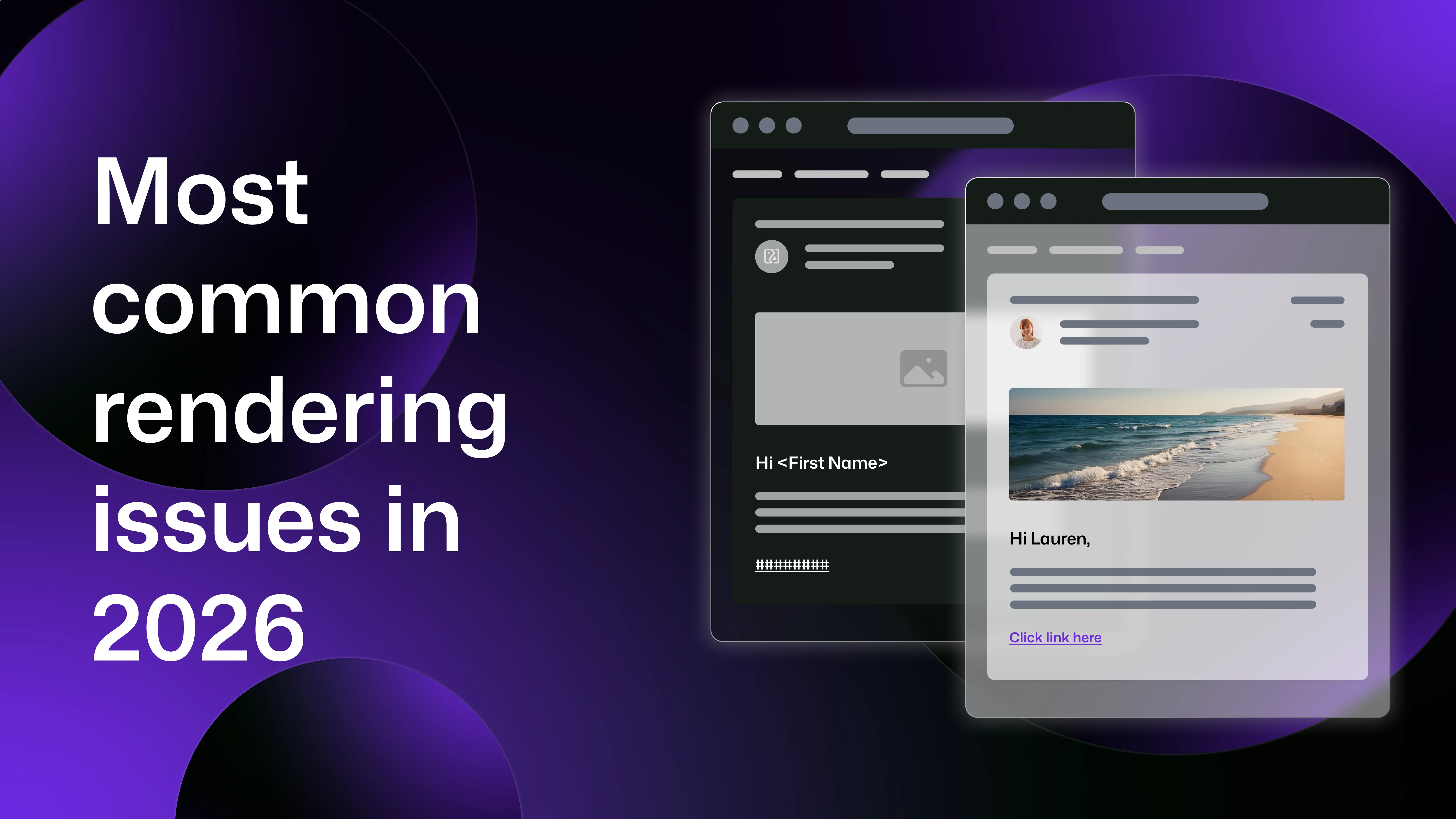
Unlike web browsers, email clients do not follow a unified rendering standard, with each client interpreting HTML and CSS differently. Paired with the fact that emails may also display differently depending on the device used to open them, you could be left with an email that looks perfect in one inbox might appear broken in another.
This is why email preview testing has become an essential part of modern development and marketing workflows. By testing emails across clients and devices before sending, teams can identify compatibility issues early and prevent broken layouts from reaching real users.
In this guide, we’ll explore the most common email rendering issues in 2026, as well as explaining how developers and QA teams can fix them.
Why email rendering is still difficult in 2026
Unlike web browsers, which largely follow standardised HTML and CSS specifications, email clients use different rendering engines and impose their own restrictions on HTML emails.
This disparity means developers must design emails that work across desktop email clients, webmail interfaces, mobile apps and multiple operating systems, making rendering issues almost inevitable for those who don’t preview their emails.
Email rendering problems between different email clients
One of the biggest causes of email display problems is the email client itself.
Gmail, Outlook, Apple Mail, Yahoo Mail, and other platforms all use different rendering engines which interpret HTML and CSS in different ways, leading to inconsistent layouts.
Because of these differences, developers must design emails using techniques that prioritise compatibility rather than modern web standards.
Outlook compatibility issues
Microsoft Outlook continues to be one of the most challenging environments for HTML email.
Desktop versions of Outlook use Microsoft Word to render emails, rather than a browser engine, which hugely limits the HTML and CSS features that can be used.
Common Outlook rendering problems include broken column layouts, ignored CSS padding and margins, limited font support and inconsistent spacing.
Because of these limitations, many email developers still rely on table-based layouts, and to support background images in Outlook, developers often use VML (Vector Markup Language), which is otherwise obsolete in modern web development. With Outlook’s prevalence, especially in corporate environments, checking Outlook compatibility remains one of the primary reasons teams perform email compatibility testing.
CSS support inconsistencies
Unlike web browsers, email clients have inconsistent support for CSS features.
Many email clients strip certain styles, ignore others, or apply their own modifications to incoming messages, for example, Gmail can strip out entire style blocks, and Outlook often doesn’t support background images.
Because of this, HTML emails typically rely on inline CSS, simplified layouts and nested tables for structure. This approach improves compatibility but makes email development significantly more complex than standard web development.
Dark mode rendering issues
Dark mode has become widely adopted across operating systems and email clients, with up to 41% of certain audiences opting to use it to open their emails. However, despite its prevalence, the additional rendering inconsistencies it introduces remain a big issue in 2026.
For example, some email clients automatically invert colours, while others partially adjust styling or apply their own dark theme logic. Common dark mode rendering problems include dark text appearing on dark backgrounds, brand colours changing unexpectedly or even logos disappearing on dark backgrounds.
Because each client implements dark mode differently, testing emails in both light and dark modes is essential.
Image blocking
Many email clients block images by default for privacy and security reasons, which can dramatically affect how an email appears in the inbox. If a design relies heavily on images, blocked images can result in users missing calls to action, large blank sections in emails, or missing banners (which may contain your key messaging).
Due to the nature of this being related to security, there’s little you can do to change users’ settings, however there are best practices that can be followed to limit the impact of this:
- include alt text for all images (so you can still explain what’s in the image)
- avoid placing critical information inside images (so customers don't miss details if images don't load)
- design emails to remain readable without images Testing how emails appear when images are disabled is a key part of email preview testing, especially when some companies put their brand imagery into every email header and footer.
Font rendering differences
Another common issue is inconsistent font support across email clients. Many email clients support only a limited range of fonts, and some ignore web fonts entirely (meaning the client defaults to their usual font instead).
While this may not seem like a big deal, it can cause issues in spacing of your emails, alignment problems, and text wrapping differences.
Developers usually mitigate this by defining fallback font stacks, ensuring emails remain readable even if custom fonts are not supported.
Email rendering issues between different devices
Email rendering differences are not limited to email clients. The actual device used to open an email also affects how it appears. With most people using a mix of mobile and computer to open their emails, this can cause issues not just between users, but if the same user opens your emails on different devices too.
There’s a whole host of factors impacting how emails may render, including screen size, operating system, mobile email apps, and device-specific layout behaviour. With some statistics suggesting over 55% of emails are opened on mobile devices, mobile compatibility is an essential consideration.
Mobile responsiveness issues
One of the most common problems across devices is poor mobile responsiveness.
Emails designed primarily for desktop viewing may display poorly on smaller screens, with common issues including text that is too small to read, images overflowing the screen, and buttons that are difficult to click. To address these issues, developers often use responsive email layouts (which can adapt to different screen sizes and settings), and single-column designs, which are often considered to be the most mobile-friendly.
Differences between iOS and Android email apps
Emails can render differently depending on the mobile operating system.
While iOS devices typically use Apple Mail, which relies on the WebKit rendering engine, Android devices may use Gmail, native Android mail apps, or third-party email apps. Each app has different rendering behaviour, with differences affecting font rendering, spacing and padding, responsive behaviour and image scaling.
This is why it’s so crucial to test emails across both iOS and Android environments, to identify these issues before sending.
Differences between device models
To complicate things further, even within the same operating system different devices may display emails differently.
Different iPhone models have different screen sizes, for example, and Android devices vary widely in resolution and pixel density. As you may have guessed by now, these variations can affect layout scaling, image proportions and responsive breakpoints. Because of this disparity, email testing across a range of devices is essential.
How email preview testing helps prevent rendering issues
The good news is that there’s one failsafe way to prepare your emails for the scrutiny of the world: preview testing.
Email preview testing tools put you in the driving seat- allowing you to choose the devices and email clients your customers actually use to generate previews of your content on. This means that your team can catch issues before your emails are even sent, so your messages can be adapted accordingly and your users won’t receive broken or inaccessible content.
With Mailosaur’s email preview testing, your team can test email rendering across devices, email clients, and display modes (even landscape and portrait!) making it easy to fix issues before your customers even get to see them.